Eleyo
Eleyo provides software solutions to support childcare centers and after-school programs across the country. As “the most robust program management software,” it’s trusted in over 37,000 facilities serving 1.5 million students.
My team was initially asked to make the Eleyo Childcare Attendance app easier to learn for new users.
In fact, our research revealed that experienced users struggled as well, frequently making mistakes that complicated their work and in some cases gave parents access to sensitive student data.
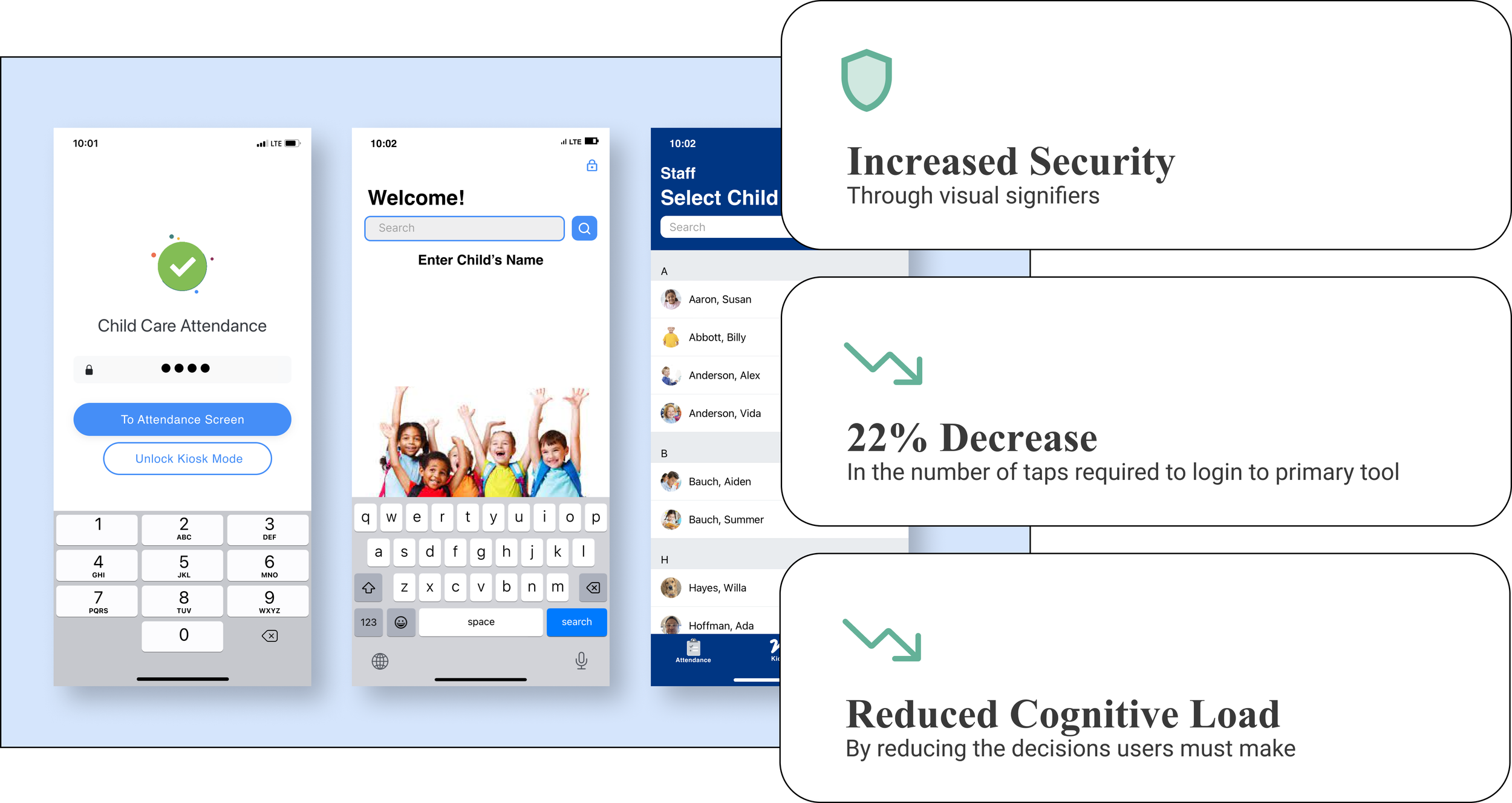
My recommended updates aim to increas the security of sensitive student information, reduced cognitive load for users, and decreased the number of taps required to complete core functions by 22%.
Discovering that all users struggle with some elements of the app
Wanting to learn about the struggles that new users were having with the Eleyo App my team and I planned a contextual inquiry study with users in leadership positions responsible for training new employees. Our expectation was that they would describe their first-hand experience helping new users navigate pain points.
As it turned out even these experienced users made some errors while showing us how they train new users.
Additionally, they described the most common problems they’ve encountered.
Here I am, facilitating an interview with a participant
Specific Opportunities to Improve the App
1. In stressful settings users can’t afford to be thinking about how to use the app
One important takeaway from the contextual inquiry is that this app is used in stressful and fast-paced environments that create significant cognitive load.
Workers might simultaneously need to supervise a room full of children, address the needs of individual children, and interact with parents. Any usability issues in the app are exacerbated by these conditions.
2. Visually similar screens are confusing
Many screens are similar to one another, leaving users tapping back and forth to find what they are looking for.
One example is the log-in/out feature which can be set to a secure parent-facing “kiosk mode” for use during pick-up and drop-off.
Unfortunately, the secured and unsecured modes are visually indistinguishable.
This leads to confusion among staff who might inadvertently leave parents a couple of taps away from sensitive information including medical and behavioral data.
3. Signing kids in and out takes too long
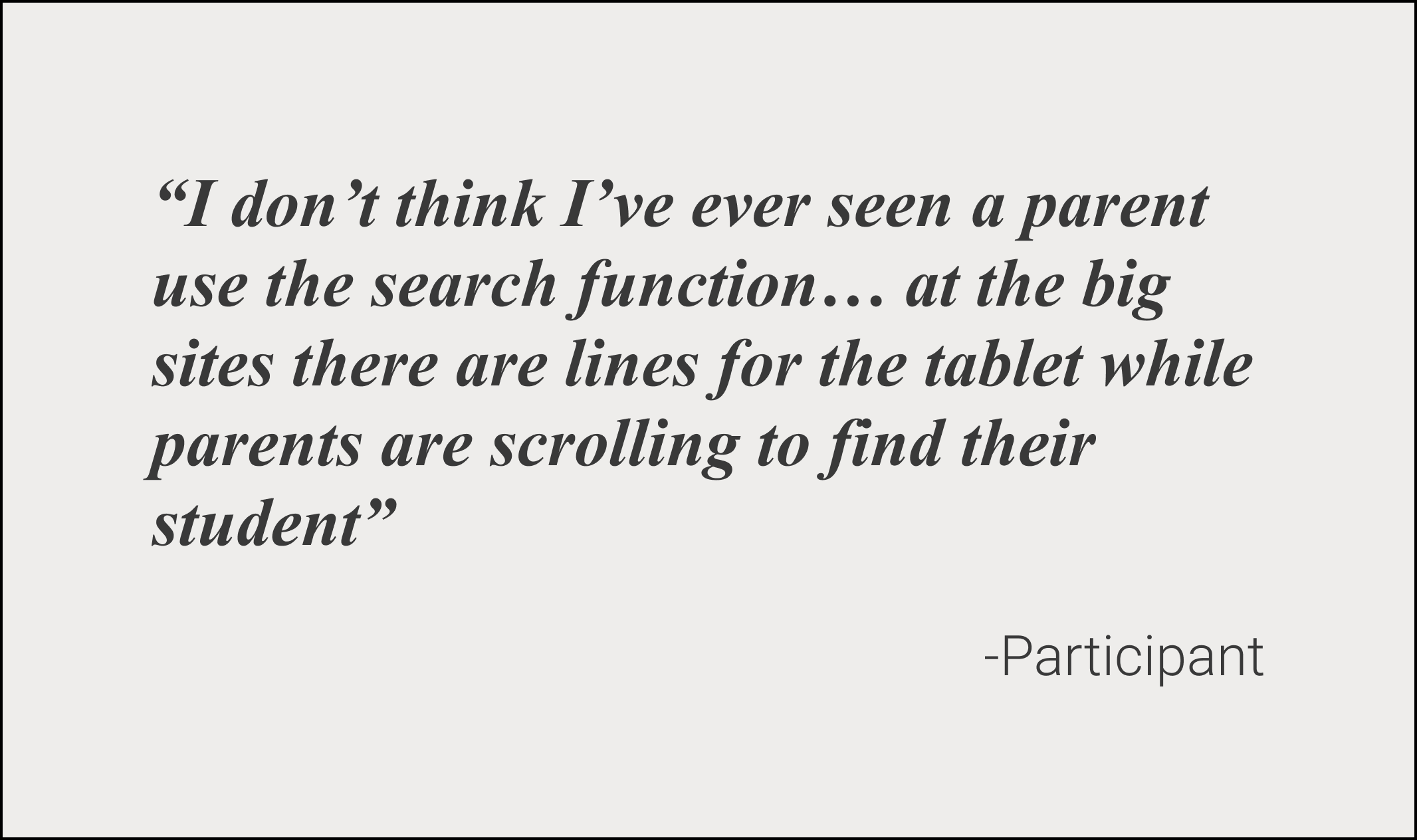
When signing students in and out parents don’t use the app’s search function to find their kids’ names, instead, they elect to scroll. At a site with 150 or 200 students, scrolling is cumbersome and causes delays for other parents.
4. Login design is inconsistent with user needs
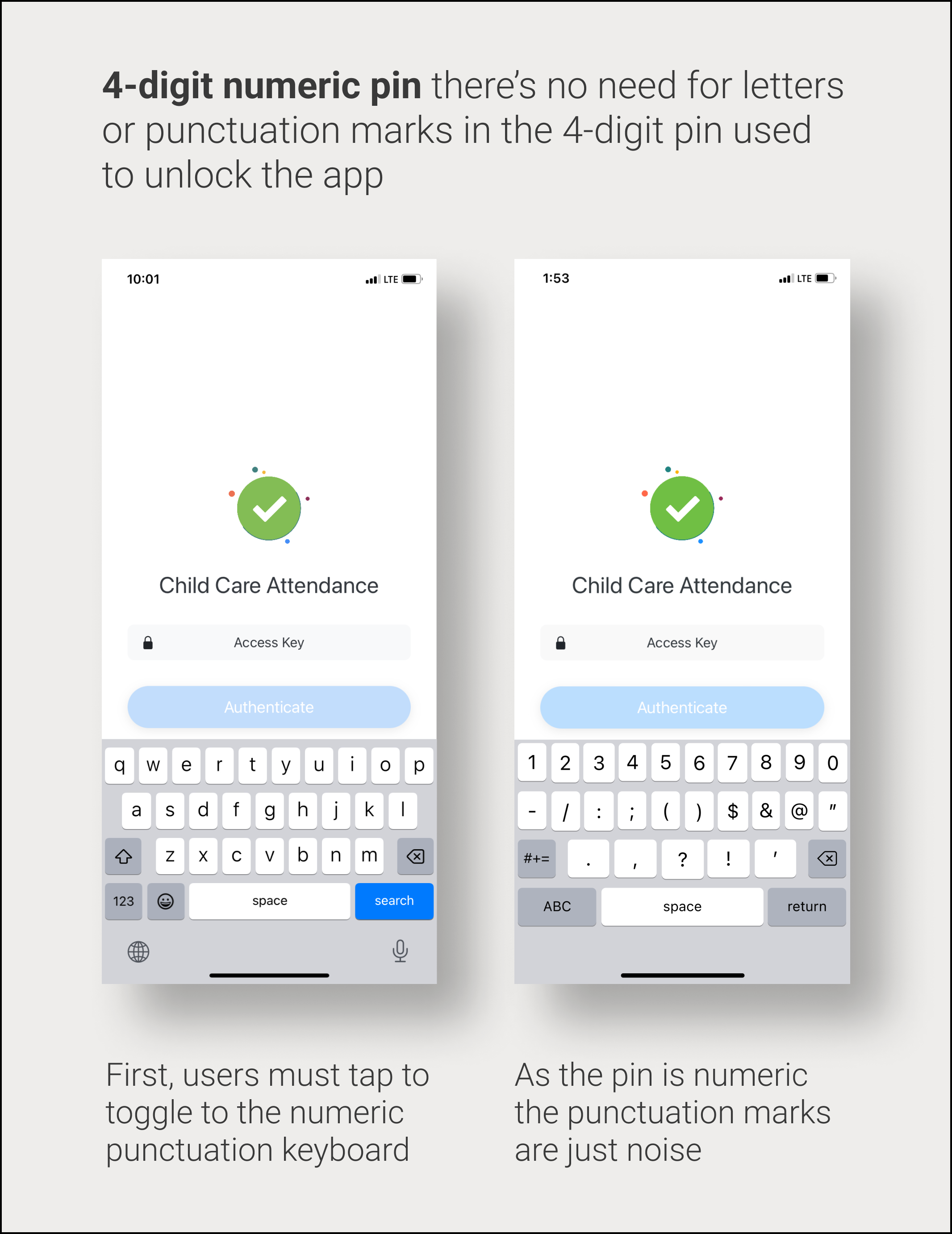
Logging in to the app requires a numeric 4-digit pin. However, the default keyboard setting is alphabetic. This requires users to manually toggle to the numbers and punctuation keyboard - this keyboard works but isn’t ideal as it contains punctuation keys that won’t be part of the user’s pin.
Additionally, after unlocking the secure parent-facing mode users are brought back to the staff-facing attendance screen - not the logical screen to be brought to and one more snag creating extra cognitive load.
Design Solutions
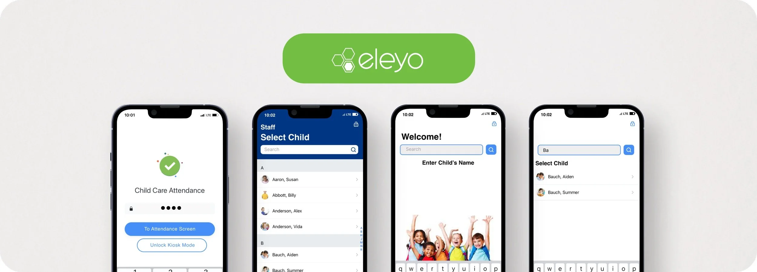
Now the default keypad is numeric eliminating an unnecessary step for users. Additionally, the user can choose to be brought to the attendance screen (where users told us they generally want to go from this screen) or to simply unlock kiosk mode.
Before and after my revisions to the login screen
Staff facing sign in/out screen
The blue colorway makes this screen distinct from others. This change minimizes confusion and serves as a reminder to staff that this screen is not secure -reducing the possibility that staff forgets to put the device in secure mode before parents have access to it.
Numeric Keypad + control
Before and after my revisions to make the staff sign-in/out more visually distinct
A simplified parent interface has a lower learning curve and forces parents to use the most effective search method possible.
Before and after my revisions to make searching large numbers of students easier.
Parent facing sign in /out screen
Results
My recommended improvements make accessing the core functions effortless and reduce the risk of user error ensuring that users will be able to devote more energy to interacting with children and families. This improves customer service, increases the safety of the physical environment, and protects the facility from the risk of legal issues stemming from the failure to protect sensitive information.
FILES
Have a look at some of my other work
Travefy’s Feedback Management: Eliminating user confusion while improving workflow and increasing efficiency
Travefy Marketplace: Pursuing increased conversion, and new potential revenue streams with a new core feature.

