Travefy Marketplace: Connecting a world of Travel Professionals
Case Study: Pursuing increased conversion, and new potential revenue streams with the launch of a new feature that allows travel professionals to find and share library items on Travefy.
Role: Design, Research, Testing
Timeline: 3 Months+
Tools: XD, Miro, Notion, Intercom
What is Travefy?
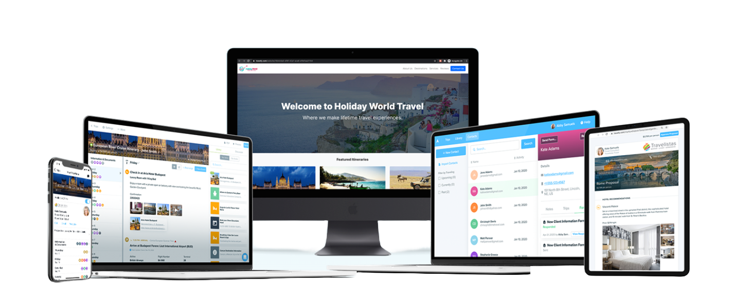
Travefy is an award winning platform that provides tools for travel professionals to create experiences their customers love.
Travefy powers millions of itineraries for travelers across the globe and is the chosen tool for thousands of industry professionals to plan travel, win new customers, and manage client relationships.
The Problem
Library sharing was missing core functionality and forced users off of Travefy.
To fully utilize Travefy’s core product - the itinerary builder, users had to engage in a labor intensive process of manually creating library items. Once up and running the system is fast and easy, but getting started was a nightmare.
From a business perspective this issue interfered with new users converting free trials to paid accounts.
From a user perspective it slowed a travel advisor’s ability to expand the range of travel they sell.
Travefy had already created a bare bones function for users to share library items via link but it wasn’t searchable and required using email or social media which took the process off of the Travefy platform.
User research
What is the current resource sharing workflow in Travefy and how does it fail to meet users needs?
We already knew that some users were leveraging the basic library sharing functionality but that it wasn’t meeting the needs of most users - to understand why I engaged in an analysis of discussion in our user groups on facebook in with our customer service team. I was curious about a few things:
What are users doing already?
What about the current workflow doesn’t meet users needs?
Why don’t more people use library sharing?
What about library sharing is working well?
Main Insight: With no searching or browsing infrastructure the burden of connecting users and resources was on our community of users.
I learned people were actively asking each other for resources of all types from itinerary to workflow. Not every request was answered but many were, and in some cases people simply posted to share things they had created recently.
On top of this there were literally thousands of library items that users had elected to share publicly for anyone to download but with no central hub for resources users they simply couldn’t be accessed.
Additionally: Some people were already selling Travefy content on their own websites or selling their services as virtual assistants to build Travefy content for others and they might benefit from the structure and security that could be provided by a more centralized system.
Industry Research
A natural solution to the problem was simply to give users direct access to all the shared resources - a “marketplace” of content.
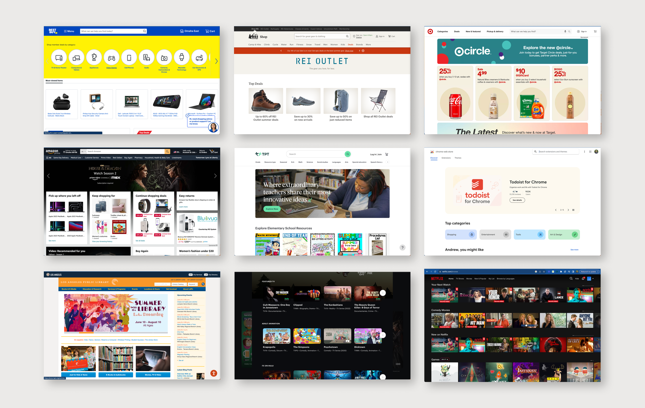
To conceptualize what this solution might look like on Travefy I conducted an audit of how other businesses help their users browse, search, and preview content from a large list of options.
Comparative Analysis: I looked at streaming services, app stores, e-commerce and even my public library.
Overwhelmingly, the companies I looked at have reached the same conclusions:
Browsing is largely category driven with the caveat that e-commerce uses more marketing heavy elements on home pages to funnel users to desired categories
Sorting and filtering are universal and most interfaces required a user to initiate a search before being able to apply filters or sort
Previewing items follows a pretty predictable pattern, with a large image or preview and top-level details above the fold and a description and other information below the fold.
Design
This research informed two main design decisions.
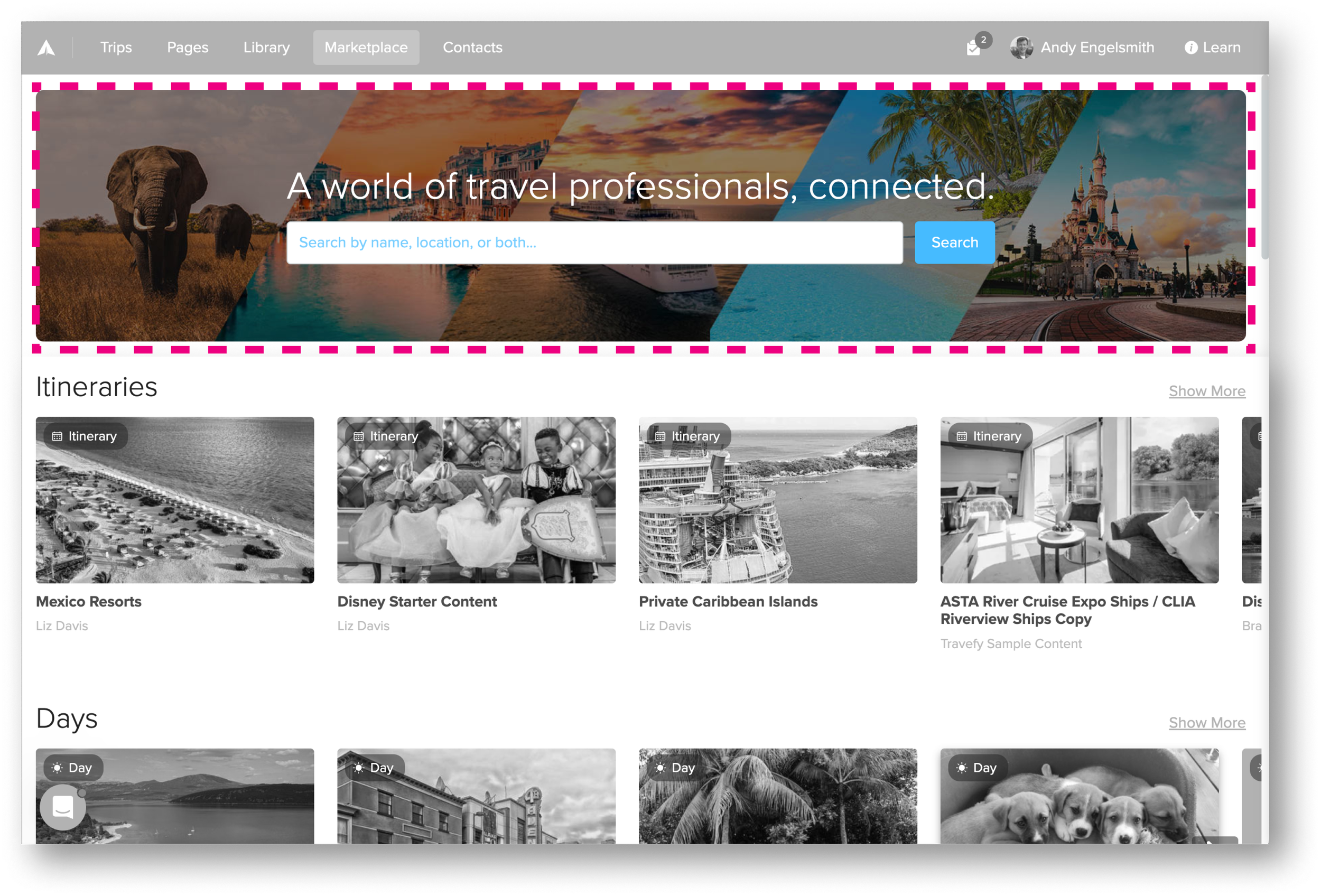
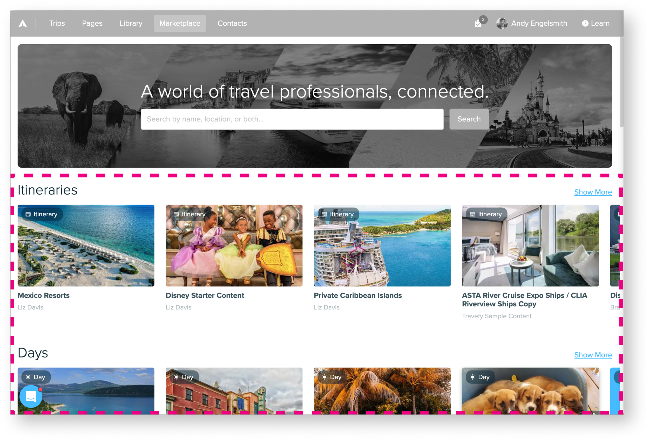
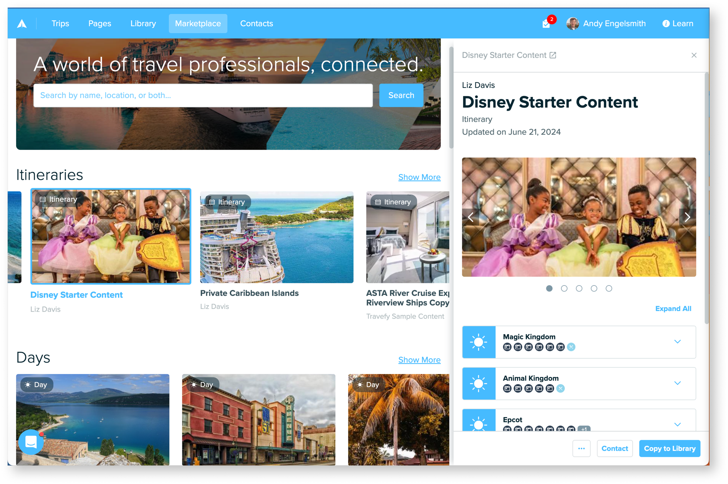
1. The browsing and search experience should be rooted on a home page with featuring an array of item cards organized into categories.
Since this would be a unique tool in Travefy I wanted to incorporate some visual cues which would help users immediately understand its purpose and use.
I started with a large search bar below copy I wrote to be equal parts evocative and instructional “A world of travel professionals, connected.”
Below that I organized cards into categories to facilitate browsing experience
2. Allow detailed exploration of an item with a side-panel preview
For the item preview interface the engineering team encouraged me to leverage an existing element on Travefy, a legacy component from the initial release of basic sharing functionality in 2022.
This component was a solid starting point but with fly outs opening on top of fly outs and elements resizing in jarring ways it had been in need of UI love since its creation.
yeesh, this could benefit from some refinement.
To address the issues with fly outs and resizing I opted to collapse information within a series of cards representing highest level elements.
This would mean a bit more scrolling on the part of the user but allowed for a more refined and pleasant interaction.
After my revisions to make the interaction feel smoother.
Here’s what that component ended up looking like expanded as a side panel.
Testing
With initial designs finished I was ready to begin refining and was eager to pressure test our concept. I planned and conducted a series of usability tests and user interviews.
These tests attempted:
To determine if users could easily complete core and peripheral tasks
To validate the this approach as a solution to the problem
To validate the way items were categorized
To learn more about how users expect to be able to browse, search, and refine their search results
Participants:
10 participants
Experienced Travefy Users
Mixed experience with library sharing
Scenarios:
One: One day you open Travefy and see a new item “Marketplace” in the top navigation you click it… what do you see? what’s it for? What do you do with it?
Two: Imagine you’re planning a trip for a new client who will be visiting Rome and enjoys learning about architecture.
Findings and Design Refinement
Finding #1 - Accuracy is extremely important
“If I can’t trust something is accurate then I can’t use it with my clients.”
Users told us again and again that accuracy of content is paramount. Initially we discussed creating a rating feature for items, however before undertaking this heavy lift we asked ourselves if there were simpler alternatives.
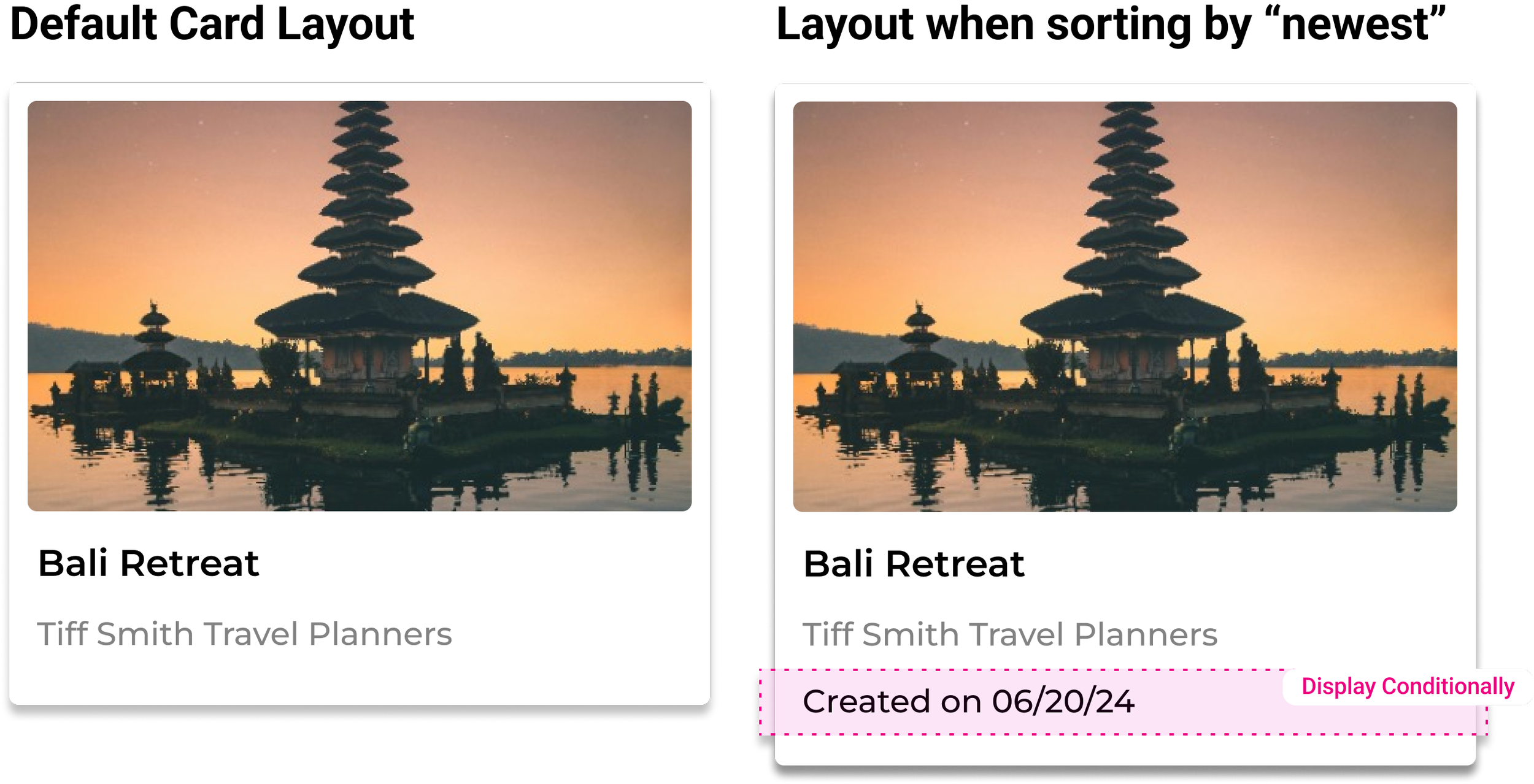
Discussions with users suggested that the most common culprit for inaccurate content is that it’s out of date. So our first step to addressing the problem of accuracy was simply displaying “created on/edited” on dates in the item preview and displaying it conditionally on the item card when the user sorted by “recently updated.”
Finding #2 - Users need to be able to refine search results
One really clear need that came out of testing was the sorting and filtering needs that users had. It was always part of the plan to include this once I had a better sense of how users would want to refine their search results.
Real estate was getting tight on the Marketplace home page and in many other areas in Travefy and after consulting with the Design Manager and the engineering team we made the decision to develop a collapsing feature as a refinement to the filter panel we used in other places in Travefy.
Finding #3 - When browsing users don’t find content that’s relevant to them
It was clear from watching users that browsing was helpful for establishing a sense of what could be found on marketplace but because selling travel can be so niche it wasn’t the best way for users to find items for their library since so many different types of travel and locations are all featured on the homepage and even at the category level.
Future Opportunity: Looking to the future we’ll explore ways to customize users Marketplace home pages, possible by what’s in their libraries already, by what they most commonly search for, or even with some kind of quiz or survey.
Outcomes
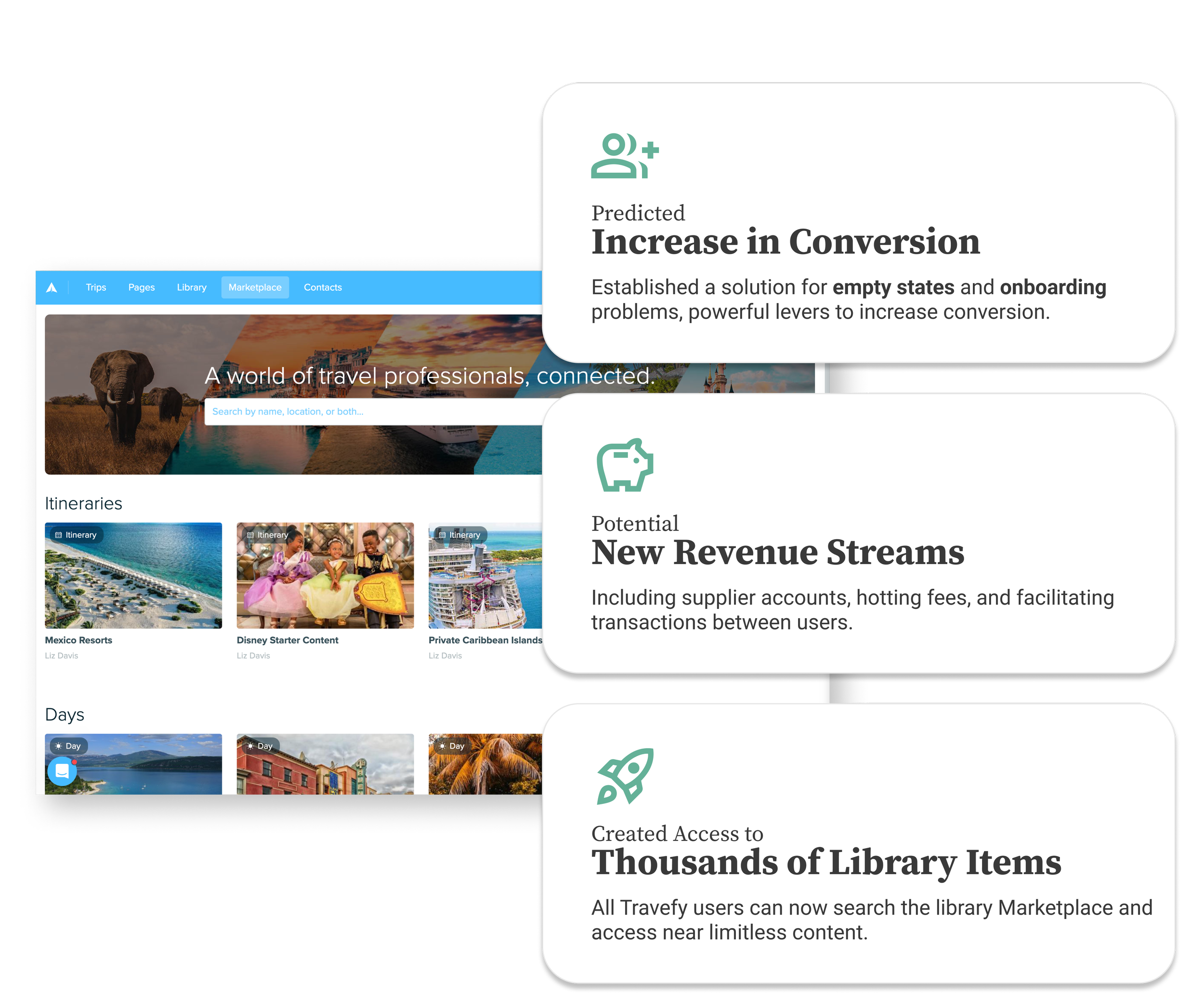
Established a solution for empty states and onboarding problems - powerful levers to increase conversion.
Moved content sharing from 3rd party platforms on to Travefy, keeping traffic on our site and creating new potential revenue streams like supplier accounts, hosting fees, and facilitating transactions
Created access to thousands of library items for all Travefy users
Have a look at some of my other work
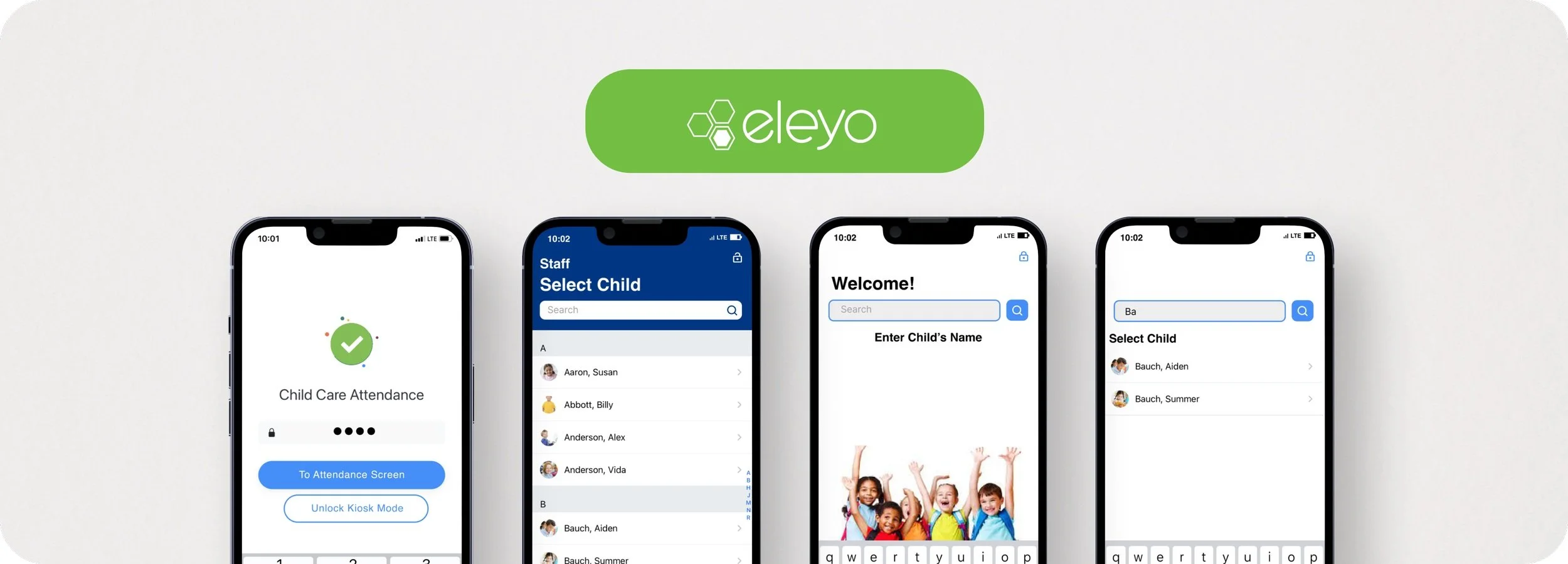
Eleyo Child Care App: Improving efficiency and security by designing against errors.
Travefy’s Feedback Management: Eliminating user confusion while improving workflow and increasing efficiency

